— PROJECTS
FCM Arrivon
HelloFCBT
— ROLE
UX/UI Designer
Branding
Video Production
— TOOLS
Sketch
Hotjar
Adobe Creative Suite
Final Cut Pro X
— TEAMS
2 Development teams
2 PO
1 PM
1 UX/UI Designer
— TIMEFRAME
14 months
I was the sole UX/UI designer at FCM Travel Solutions, stepping in a few months after the previous designer had left—so no hand-over, just a deep dive into her files and past work.
I improved the user experience of FCM’s global corporate-travel platform: designing new features, streamlining user flows, and working closely with developers and product owners to deliver intuitive booking and travel-management tools. I also set up and designed a support chatbot, then trained the support team to use it and boost customer interactions.
When Flight Centre acquired FCM, I helped turn the platform into a white-label product that matched Flight Centre’s branding while still supporting the ArriveOn base code. I reorganized the design system so developers could keep a single codebase for both brands.
When my manager discovered I shoot and edit video, she asked me to produce the company’s annual corporate-event reel. The team loved the result so much they asked me to also film a recruitment video, a pair of small, but really fun, side projects.

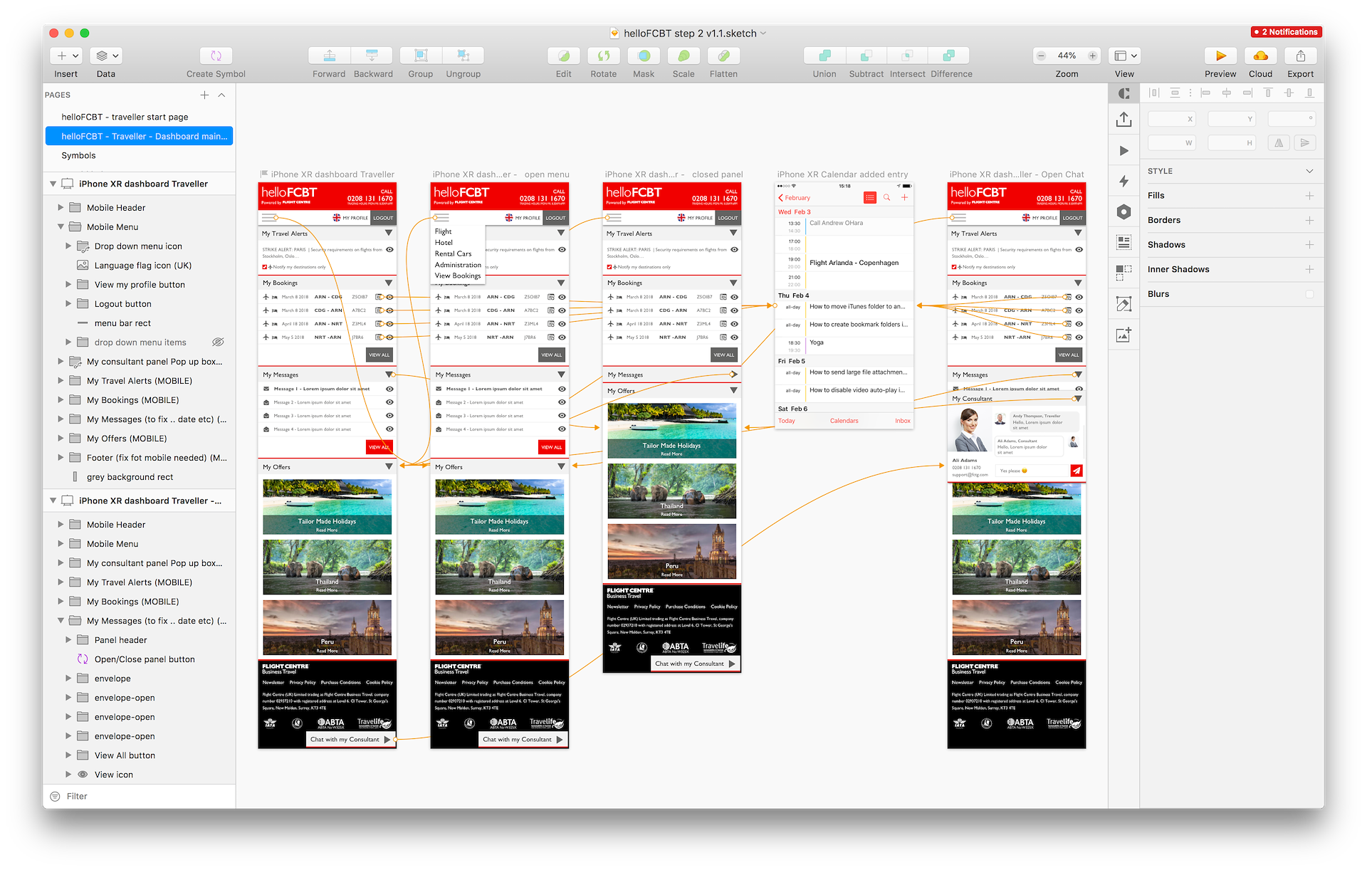
Example mobile flow of traveller dashboard with Chatbot
UX Audit – Fresh eyes review
When I start a new project, I explore the flows with ‘fresh eyes’ and note what I believe could be improved.In my experience, capturing these observations before I grow accustomed to the application helps me get into the mindset of new users.
I usually spot low-hanging fruit, confusing elements, and generic flows that need rethinking. More complex, domain-specific areas I’m not yet familiar with may make sense later, but recording them early still provides a starting point for clearer communication and structure that speed onboarding and learning.
Audit Framework
- Onboarding
- Navigation
- Visual & Functional Consistency
- Visual Hierarchy
- Interaction Design
- Error Handling
- Technical Constrains
Feedback and action points
For this project I presented an initial 32-page slide deck filled with screenshots and post-it notes for the team. It let me gather their input and understand the decisions and thinking that had led to the product’s current state.
This also covered UX copy, flagging mixed terminology like using “train” in some places and “rail” in others.
During this session we sort the ideas into low-hanging fruit, medium and bigger sized tasks. Which became some of my initial tasks with the team.

Competitive Audit
Once I was onboard and understood the tool and business goals, I ran a competitor analysis, checking how other flight-booking, car-rental, and train-booking platforms tackle similar problems. I noted what worked, what didn’t, and which ideas I liked but wouldn’t suit FCM’s needs. The goal: borrow the best concepts and adapt them for FCM’s corporate-travel audience.
Flight booking – UX driven Algorithms
One part of improving flight bookings was refining the filters and ensuring the most relevant results surfaced first. I adjusted default filter ranges, enabled buttons only when contextually relevant to cut cognitive load, and added support for corporate-specific fares.
I proposed conceptual ideas for how the search algorithms could work to improve the user experience, providing clear guidance on the desired results rather than coding. To refine these proposals, I sat down with the developers and walked through what the APIs could return, typical response times, payload sizes, and how they handled booking conflicts.
Their insights helped me shape ideas that fit within those limits, balancing usability with the constraints of external services and the existing codebase. It was an interesting and fun challenge to think about usability in the context of technical limitations of external systems in combination with the current code base.

Agile UX around Tech Debt
Improving an existing product brings different challenges than designing from scratch. Big flow changes weren’t possible because the team also had to prioritise urgent feature work and bug fixes, so I started with low-hanging fruit and mapped out step-by-step tweaks that would steer the product in a better direction.
I worked closely with the development team to understand which parts were difficult to change and where technical debt might affect my design choices. I believe my software-development background helps me grasp these constraints and design with them in mind.
Hotel & Car Search
The goal was to improve the quality of search results and make filtering easier to match the needs of corporate travel users.
Their existing system offered two search modes; “schedule” or “price.” I pitched combining them into one unified search that weighs both factors simultaneously, giving users the best of both worlds.
Car search was the least-used feature—a classic catch-22. To figure out whether the issue was low demand or weak UX, I drafted a quick research plan: short in-app polls and follow-up interviews with frequent travellers. Although we didn’t have time to run it, the outline was ready for the team’s next iteration.

Hotjar insights
The team already had a Hotjar pipeline running, so I dug into the backlog of heatmaps and set up some recordings of my own. I pulled the highlights into a short slide deck with example heat maps and bar-chart summaries.
A few takeaways:
- Streamline filters and sorting – fewer controls, smarter defaults.
- Clean up input fields – follow standard patterns and label clearly.
- Unify copy and terminology – pick one: rail / train, flight / air.
- Hide dead ends – don’t show prices that are “N/A” or options you can’t select.
- Cut extra steps – too many confirmations slow booking and confuse less-techy users.
- Progressive results loading – show the first hits fast, keep paging in the rest.
- Consistent error feedback – same style, same place, site-wide.
- Map UX polish – clearer hotel pins, fix the barely-used car map.
I compiled the findings into a “General UX Improvements” list that was added to the backlog for the next sprint.

Payment & Invoicing
Corporate travel adds extra payment layers that regular flight-booking sites don’t handle: company approval flows, price and travel restrictions, invoicing support, and more.
I refined the payment flow that supports corporate invoicing and I revamped the booking-confirmation emails to make them clearer and on-brand.
Finding incremental wins was challenging because the flow really needed a larger overhaul. With limited development bandwidth and higher-priority fixes in the queue, I focused on quick, high-value tweaks while parking the big-ticket ideas for a future roadmap.

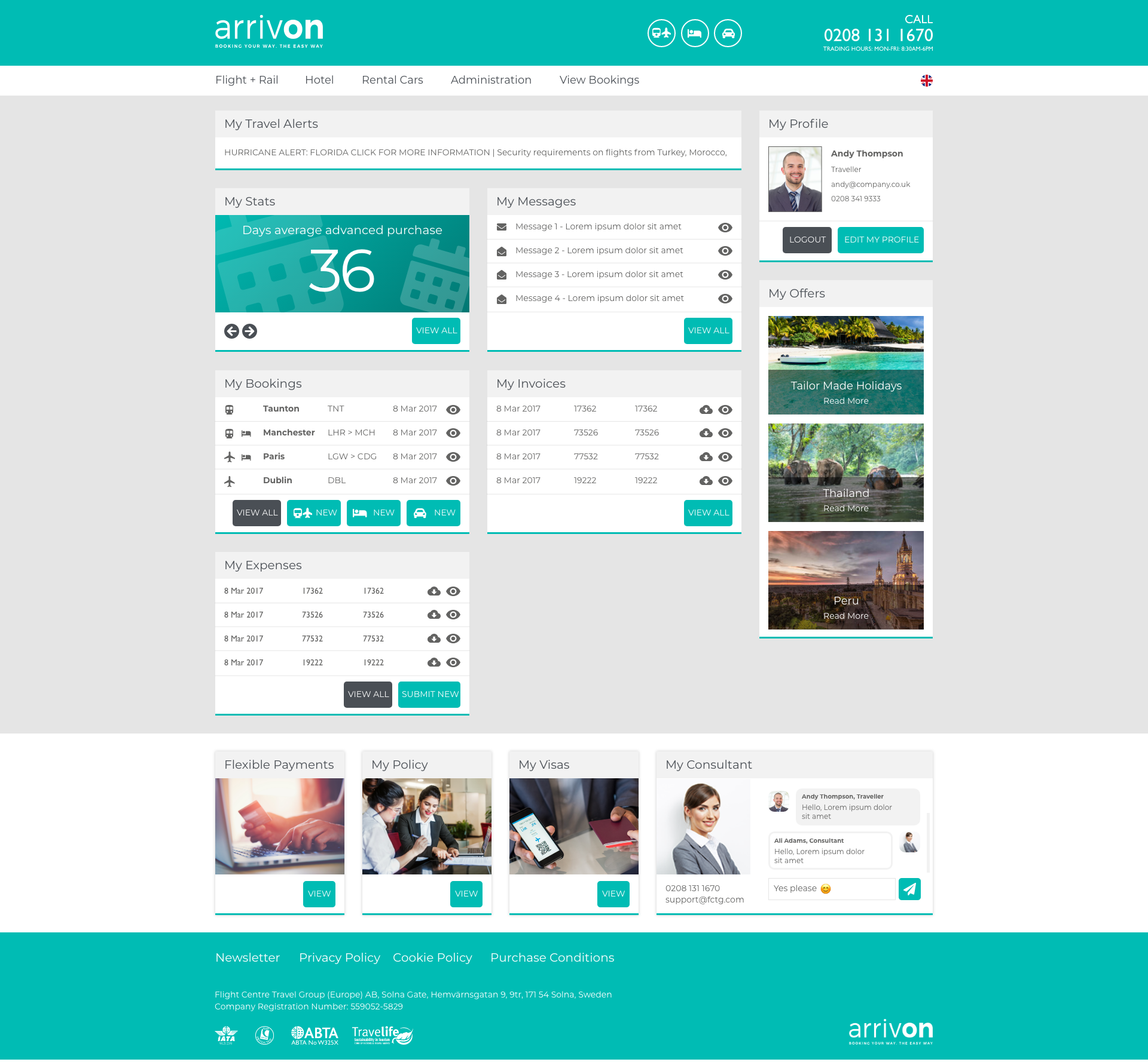
CUSTOMER DASHBOARD
In a corporate travel platform, travel managers need a single dashboard to view all employee trips and invoices.
Below are screenshots of this dashboard in both ArrivOn and helloFCBT branding, displayed on desktop and mobile.
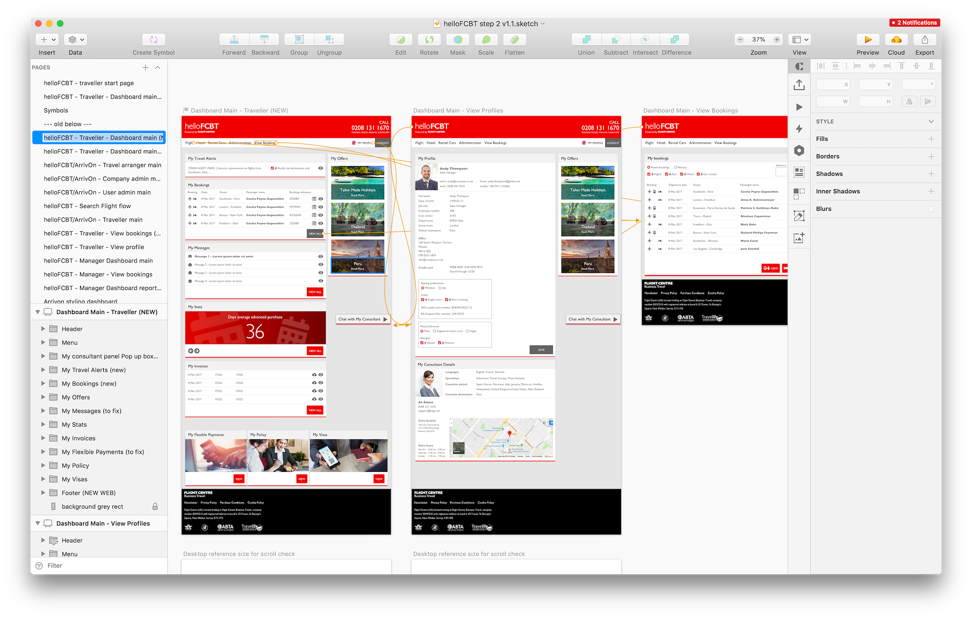
helloFCBT branden Dashboard
— PROJECT NAME
Chatbot feature
— ROLE
Design
Branding
Support-team training
Challenge
The support team consisted of four to six agents who handled all support by phone. FCM wanted to introduce a chatbot to improve response times and let the team assist more users without sacrificing quality.
Process
- - Selected a chatbot platform that met the support team’s needs
- - Branded the bot for both FCM and Flight Centre sites
- - Configured chatbot settings and backend to fit support workflows
- - Ran live training sessions with agents
- - Worked on UX copy in both Swedish and English
Outcome
- - Agents now handle up to 5× more customers at the same time
- - Wait times dropped, and agents can see exactly where users are in the flow, giving quicker and better context-aware help
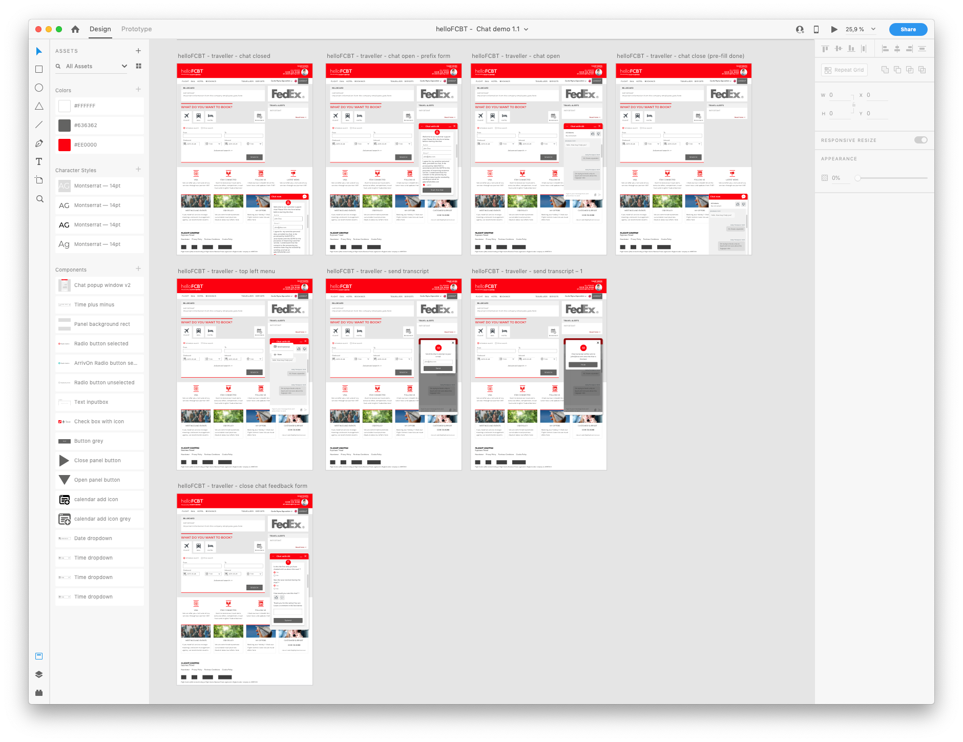
Overview of Chat states
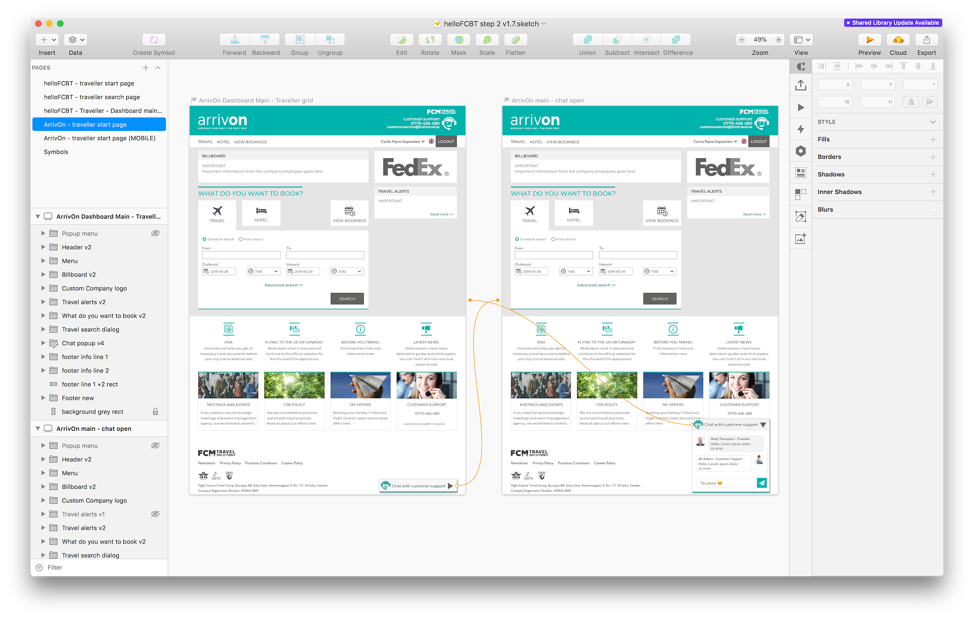
Sketch work for adding Support Chat
Smaller design improvements in the codebase
To speed up minor UI and copy tweaks, I installed the full dev environment. With the team’s help I set up IntelliJ, Maven, TypeScript, Angular, and Git, which let me commit style fixes and micro-copy updates directly to the codebase.
Handling these bite-size changes myself eased the developers’ load during tight deadlines, and having the environment ready meant I could test UX and UI adjustments and confirm they worked before going live.
ArriveOn + helloFCBT Style System
Challenge
After Flight Centre acquired FCM, the platform needed a second brand without doubling code to support both the ArrivOn brand as well as the new helloFCBT brand with their brand colors and design guidelines.
Process
- Audited design system to identify how brand colors could work across both brands, something that had not been designed with this in mind when the original look was created.
- I paired up with a few of the developers to help come up with a good structure of what design needs we had and how they could best refactor CSS styling, naming conventions, icons etc to make this transformation as painless and smooth as possible.
Outcome
- Single code base now powers both brands. New features launch simultaneously across sites. We launched the new helloFCBT site in time.

VERONIKA HARGEVIK –
Head of Product & Technology Nordics / FCM Travel Solutions
“Roberto worked with us as a contracted UI/UX Designer for about a year. He quickly picked up the rather complex landscape and product, and started to contribute.
His role covered anything from interaction prototypes to actual coding and he brilliantly covered multiple professions.
Roberto is a pleasure to have in any team; skilled, helpful, self-organized, communicative and a true team player.
I would highly recommend Roberto for similar assignments.”
