EDS+
Design System
800+ designs Adobe XD
Figma 5 years
Ericsson has an internal Red Dot award-winning design system called EDS. This system was originally designed for displaying smaller amounts of data on internal websites. The application suite that I helped create is a Windows desktop application, multi user (CQRS based), and must handle huge volumes of data for editing, display and analysis. To meet these demands, I created EDS+, an extension that builds on the design language of EDS and enhances it for working with large datasets and more complex analysis needs, adding new components and UX/UI patterns, and improving several existing components.
The Premium+ application suite consist of the following modules:
- Proposal
- CPL (Customer Price List)
- Price book
- Quotation
- Ordering
All components were built to be generic enough to be reused in any module, and I kept the same logic and UX/UI patterns throughout so users could switch between modules without a steep learning curve. Whenever I created a component, I made sure it solved the most urgent needs while staying flexible for tomorrow’s features that are still just ideas or concepts.
The design system was originally built in Adobe XD, Ericsson’s approved tool at the time. In my final months, I drove the initiative to convert all our work to Figma, enabling smarter components and boosting both productivity and collaboration.
Below you will find an initial selection of components presented with their respective design decisions behind them. They are curated from 800+ design files that I created during my nearly 5 years at Ericsson.
I’ll continue adding more component examples over time.
— UI COMPONENT
Properties panel
— FUNCTION
Search feature
The properties panel shows contextual information for items selected in the workspace, typically products listed in a table view.
Highlights
- - Toggle filtering – lets users flip between two modes. With filtering off, all properties stay visible and search hits are highlighted in blue, so you can see what sits nearby. With filtering on, non-matching items disappear, giving a clean list of just the hits for faster scanning.
- - Pinned search bar – stays at the top for long property lists, so users never have to scroll back up to refine a search.
- - Pinned search bar shadow – when you scroll down, the search bar locks to the top and gains a drop shadow, signaling that it’s “floating” above the list. Scroll back to the top and the shadow disappears as the bar settles flush with the panel, keeping the visuals clean.
- - Right-aligned monospace numbers – Numerical values use a monospace font and are right-aligned (like in the table), so digits line up vertically for quick visual comparison. Descriptive text stays left-aligned in the regular font.
- - Singular/plural copy – the label switches from “match” to “matches” automatically, a small detail that makes the text read naturally and shows care for polish.
- - Dual-field search – matches property names and values, accepts multiple keywords in any order.
- - Auto-expand sections – closed sections open when a search hit is inside; with filtering on, only matching properties stay visible.
- - Read-only vs. editable – grey for read-only fields, white for editable ones.
- - Hover copy icon – appears on mouse-over so users can copy values, even from read-only fields, without adding visual clutter.

Properties panel search functionality
— UI COMPONENT
Onboarding dialog
— FUNCTION
Introduce new features
Contextual notifications
Manual/documentation
JSON format
One challenge I discovered during UX research was that users kept requesting features already in the product. Two dedicated training specialists ran sessions for the teams, but not everyone could attend, and some still did not become aware of new features after they were released.
My idea was to add a short onboarding tutorial with every release. Each walkthrough would teach the new feature at launch, then remain in the help system so the library grows over time and new users can still find earlier tutorials even if they missed the original walkthroughs.
The four development teams had a lot of work to do, so I created a concept for a step-wise rollout of a simple interactive onboarding tutorial that the UX team could build on its own.
With just a handful of easy-to-implement features, we could deliver a solid first version of the onboarding tool
Technical features needed
- Display an image
- Accept zoom coordinates
- Overlay selection rectangles
- Display text for each step
The UX team could create one folder per feature, each containing an image and a simple JSON file that defined the steps, captions, zoom coordinates, and any overlay rectangles.
I drafted the JSON format and recommended folder structure so non-technical designers could author tutorials while developers only had to load the files, no custom editor required. A dedicated authoring tool could always be added later, but this approach let us ship quickly.
Note: The final zoom step in the video below looks pixelated because the prototype uses a low-res screenshot. In production we swap in a higher-resolution image.
Contextual notification
Another idea was to show new-feature notifications in context. Instead of presenting every feature only at startup after a release, the relevant tutorial would appear when the user opened the part of the application where that feature lives, increasing the chances they engage with it.
I designed this notification to be low-intrusion, knowing users might be busy with urgent tasks. It lets them watch the tutorial now, be reminded later, or choose not to see it again.
Onboarding dialog for a new features
— UI COMPONENT
Interactive bar chart
— FUNCTION
Interactive comparision of columns in bar chart
Accessibility
One of the first features I designed was a new bar-chart component. The earlier version wasn’t as polished as it could be and, despite claims, didn’t fully meet accessibility standards. I introduced a fresh, chart-specific colour palette that is both visually appealing and colour-blind-friendly.
A novel idea I introduced lets users click any bar to toggle a horizontal reference line across the chart, making cross-bar comparisons effortless.
Another feature shows a delta marker on hover: a small red indicator that displays the gap between the active bar and any reference line, in units, percentages, or both.
Bar chart prototype. Press Play to view video
Color Vision Deficiency
Below is a split-view slider: normal vision on the left and a simulation of Deuteranomaly on the right (the most common colour-vision deficiency, affecting about 5 % of males and less than 0.1 % of females).
I created a harmonious color palette that workes for all major color vision deficiencies; Deuteranomaly, Protanomaly, Deuteranopia, Protanopia, Tritanomaly, Tritanopia as well as Monochromacy; Rod Monochromacy (achromatopsia) and Blue Cone Monochromacy (partial monochromacy).
When a chart needs additional colours or becomes more complex, it’s best to layer simple visual patterns over the palette to further enhance accessibility.
— FEATURE/COMPONENT
DCPB Wireframe Prototype
— FUNCTION
Digital Customer Pricebook foundation
Management asked a small group of trusted senior developers to take another run at the Digital Customer Price Book (DCPB). The team agreed, on the condition that I joined as the dedicated UX designer, so we could tackle both the technical and user-experience challenges together. I devoted about 80 percent of my time to DCPB for several months and used the remaining 20 percent to support the Premium Proposal application.
The success of the DCPB tool led to it becoming the foundation on which we built all other applications. The UX/UI patterns I created, together with the robust modular code framework developed by the team, became the basis for EDS+. We expanded both the design system and the framework as new modules were added, including Proposal, CPL (Customer Price List), Price Book, Quotation, and Ordering.
To make this possible, I built a dedicated UX team that worked closely with the four development teams to create the entire application suite.
9-minute voice-over walkthrough of the wire-frame UX/UI concept, including the UX research insights that drove the full transformation of the application suite.
— FEATURE/COMPONENT
Show nested content
— FUNCTION
Visualise hierarchical data
In the old Premium Proposal application, users could view articles by clicking a node in the product tree. If they needed a full list, they had to switch to a separate All Products tab.
I introduced a novel Show nested content toggle that gives users far more flexibility in displaying product lists while also saving screen space
With the Show nested content switch, users choose what the table displays:
- - Switch off: only the articles in the selected node appear, ignoring all lower-level nodes.
- - Switch on: the table shows the articles in the selected node plus every article in all leaf nodes within that branch of the hierarchy.
Selecting the root node with the switch turned on shows every product, just like the old “All products” tab. With this new feature, the user has the flexibility of the previous variant plus the added benefit of being able to select and show specific subtrees of any branch in the hierarchy.
This is especially helpful because proposals are often organised by city or by technology, letting users quickly view those levels and any sub-organisations beneath them.
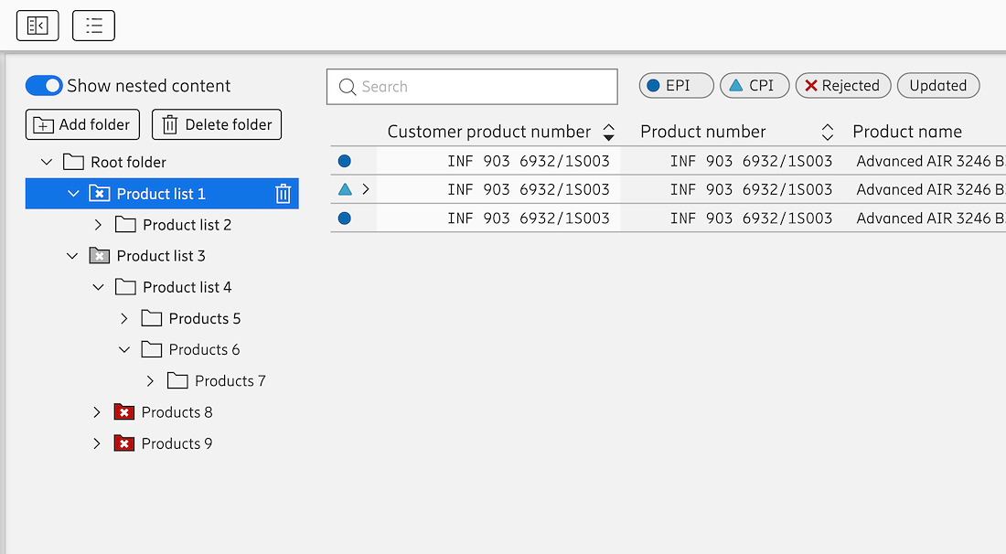
As 'Show nested content' is enabled and the node 'Product list 1' is selected then the contents of the node 'Product list 1' and 'Product list 2' will be displayed in the grid to the right. If 'Show nested content' was disabled then only the items that are inside 'Product list 1' would be shown.
— FEATURE
Main workspace
— FUNCTION
Table search and filtering for large data sets
Split-view tabs
A pricing table is one of the core, recurring elements across the Premium+ application suite. Many users are highly Excel-versed and prefer working with large, multi-column data sets. My goal was to visualise the data in ways Excel cannot, help users analyse and understand it more easily, and still give them the flexibility they expect, and making it fast and easy to find the right information.
Search principles
- Text highlighting of matches
- Multiple-keywords search
- Order-independent matching of keywords
- Fast, real-time that update as you type
Table features
- - Vertical resize bars appear only when the pointer is near, reducing visual clutter
- - Columns can be pinned left or right and stay visible while you scroll horizontally and vertically
- - Progressive rendering keeps scrolling smooth, even with very large data sets
- - Field-chooser menu for showing or hiding columns
- - Nested rows fro product groups
- Smart Search
- Special cells types for tags, checkboxes, status, multi-user indicators, and changed values
- Clear warnings and errors


— COMPONENT
Tags in table cells
— FUNCTION
Assign and remove tags
Products in the table can have one or more tags, and users need to manage these tags without widening the column too much.
- - Auto-suggest dropdown
- As users type a tag name, a dropdown lists matching tags.
- - Status indicators
- A check mark appears next to tags already assigned, a plus sign next to addable tags.
- - Clear on hover
- Moving the cursor over a tag reveals a clear (×) button for removal.
- - Overflow handling
- If tags exceed the cell’s width, an ellipsis (…) appears. Clicking it opens a dropdown showing all tags, each with its own clear button on hover. This design keeps cells compact while giving users full control over tagging.
Tag management examples
— COMPONENT
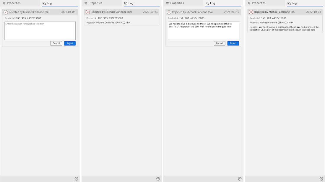
Comments/Log panel
— FUNCTION
User notifications
Product comments Version info
Challenge UX research revealed that users spent too much time handing off information between team members via chat, email, SMS, and private notes, resulting in lost context and inconsistent communication. High team turnover also meant new representatives often missed critical deal history stored in local Excel files or scattered emails.
Solution
We added an integrated comments and log panel where users can approve or decline price changes and optionally provide explanations.
The system tracks these comments, ensures full traceability, and automatically notifies the next reviewer when they become available, streamlining handoffs and preserving context. All communication lives alongside product data and version history, eliminating the need to hunt through spreadsheets or inboxes.
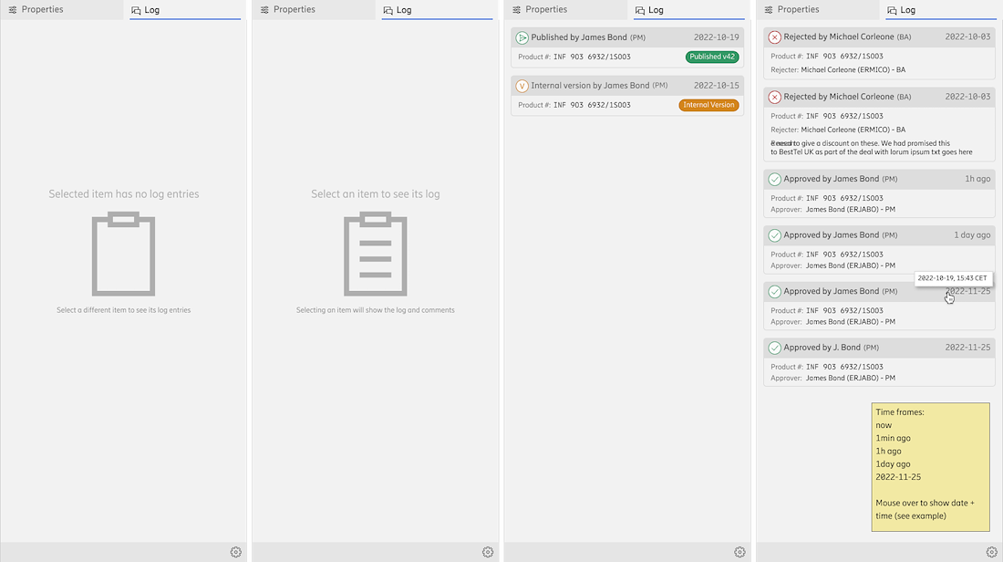
1. Empty state educating the user that this panel will show information once something is selected
2. If an item is selected by it has no logs
3. Examples of log items of approval flow
4. Examples of rejections and time frames
Example flow giving the user the option of adding a note, and corresponding log entries depending on if a note was added or not
— COMPONENT
Notification panel
— FUNCTION
Alert users to system updates, approval requests, comment tags, surveys, and more
When a notification arrives, users can see it in three ways:
- 1. Inline toast – Appears at the bottom right for routine messages.
- 2. Survey/poll prompt – pops up with a blue drop shadow to signal it’s separate from the normal UI; it’s subtle yet noticeable enough to stand out without looking out of place, and it never covers critical areas so users aren’t disrupted during important tasks.
- 3. Toolbar pill – normally blue, it turns red for urgent alerts. Clicking it reveals a top-level notification panel that slides in over the full height of the application, clearly distinguishing it from the regular side panels.
Below are sample animations: the first video shows each notification style in action, and the next two slides present additional variants for different notification types.
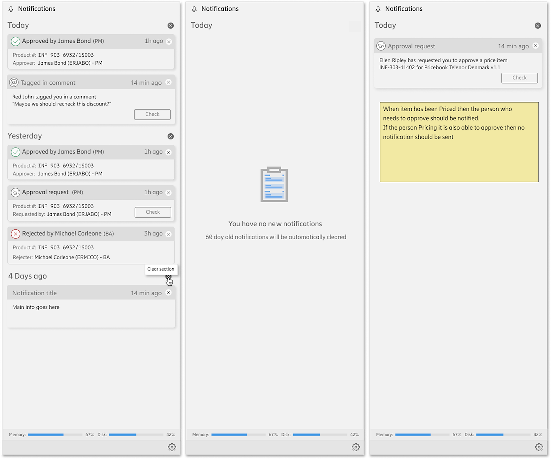
Left: Date naming goes from ‘today’, to ‘yesterday’ and then counting days
Center: All empty panels aim to guide or teach the user
Right: Approval request between users
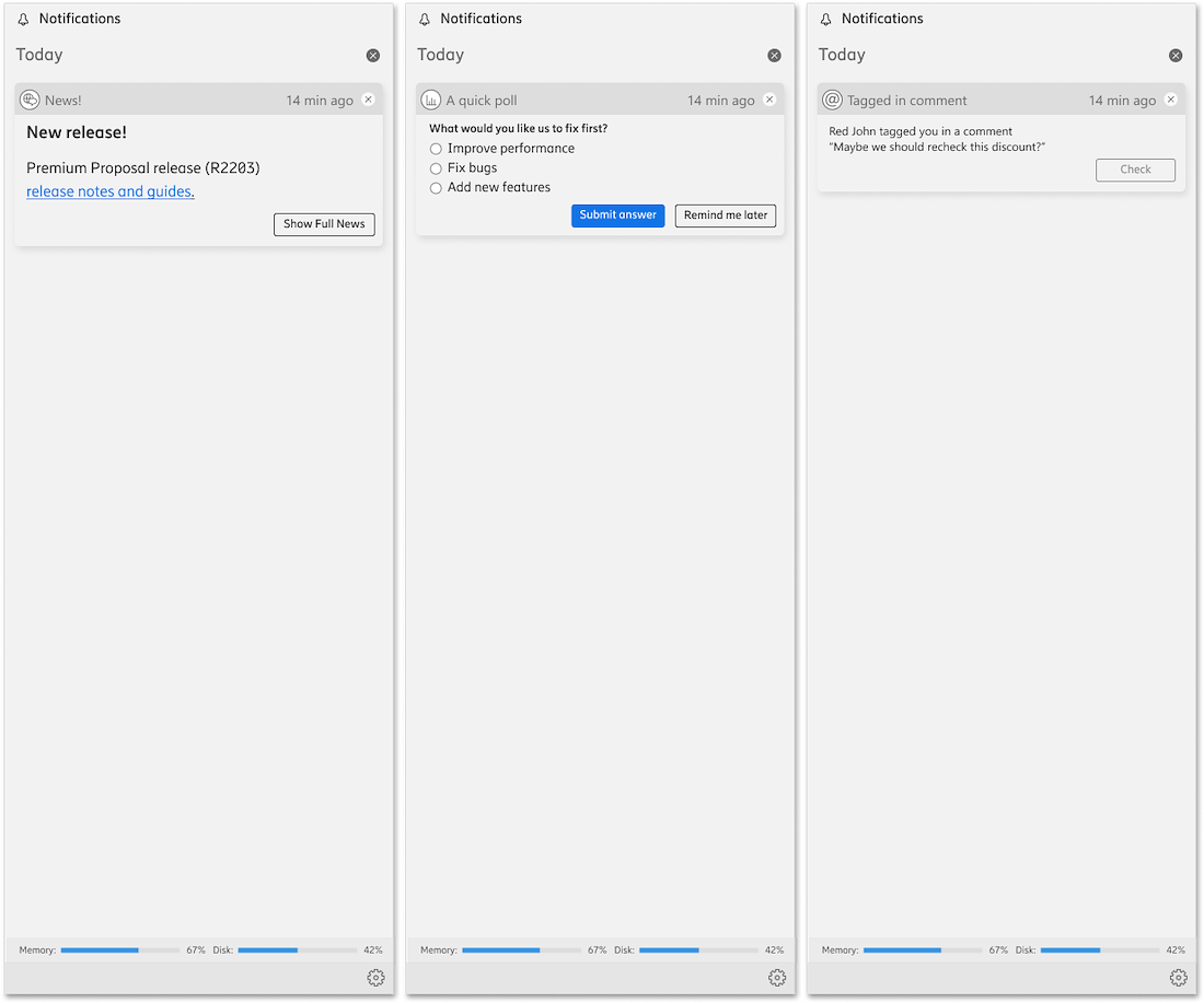
Left: News if saved will be kept in notifications
Center: Polls where the users picks ‘Remind me later’ can be found here
Right: If a user is tagget in a comment
Ayoub Moussaddad
- UX/UI Designer
“The application we worked on was incredibly complex, but Roberto has a rare talent for simplifying everything. Whenever I felt stuck, he’d break things down in a way that instantly made sense.
And his feedback wasn’t just about fixing something it always came with insights that helped me grow as a designer. I’ve genuinely improved so much under his mentorship."
“What really sets Roberto apart, though, is how he creates such a positive environment for everyone around him. He’s funny, approachable, and always makes work feel less like work. He even led our Friday fika sessions, which brought the team closer and gave us a chance to connect outside of work tasks"
